Web Design in Bury St Edmunds That Turns Visits Into Enquiries
Why your website must earn its keep every day
Your website is the most patient member of your team. It greets people at all hours, answers questions without complaint and quietly nudges the right visitors to call, book or buy. In Bury St Edmunds and across Suffolk and Cambridgeshire, most people now discover a business first on their phone, often while juggling other tasks, and they give you a few seconds to make sense. If your pages feel slow, crowded or vague, even the most elegant brand will struggle to convert interest into action. The aim is not clever tricks. The aim is a fast and welcoming experience that makes it obvious what you do, why you are a safe choice and how to take the next step. When a site is planned with that purpose, every decision from layout to copy to tracking becomes easier, and results tend to follow.
Begin with a promise and a path
A useful home page does two things very well. It makes a clear promise and it points to the next steps. The headline must speak in plain language to the person you want most, whether that is a homeowner in Bury St Edmunds looking for a trusted roofer, a cafe guest checking a menu or a clinic visitor seeking reassurance before a consultation. The short paragraph that follows should add a little proof and remove a little doubt. Then present a small set of obvious paths. If you offer several services, show them early with short descriptions and a button for each. If you sell a single flagship service, give it space to breathe and add a second button for people who just want to talk. When the above sits near the top, the rest of the page can play a supporting role rather than trying to do everything at once.
Plan structure like you plan a building
Information architecture is invisible when it works but painful when it does not. Keep your primary navigation short and sensible. Five or six items are usually enough, with contact or book placed where it is always visible. Group related subjects into simple drop downs only when you truly need to. Create one service page per service and give each a job to do. That page should explain the value, outline what to expect, answer common questions, show proof that you are capable and end with a clear invitation to enquire. A projects or work area should go beyond pretty pictures and include short notes on the problem, the approach and the outcome so that a visitor can imagine you solving their version of the same issue. When every page has a defined job, editing becomes a process of removing clutter rather than adding decoration.
Design for the way people really browse
Most visitors skim on mobile, and they make decisions based on a handful of cues. Type must be readable without pinching to zoom, buttons must be easy to tap and contrast must be strong enough to work outdoors in daylight. Resist the urge to crowd every inch of the screen. White space is not wasted space. It is what allows the eye to land on the words and calls to action that matter. Choose one or two typefaces, keep sizes generous and use a calm rhythm of headings and paragraphs. If your brand colours are bold, use them with care for accents and actions rather than for large blocks of background colour that fight with the text. A good mobile layout often reads like a series of scenes. Each scene should have a small job to do and a gentle nudge forward.
Keep speed as a non negotiable
A slow page whispers that you do not value the visitor’s time. Trim images to sensible sizes, use modern formats and avoid heavy scripts that add little value. If you use Webflow or a similar builder, keep interactions restrained and test on a real phone over mobile data. Remove third party widgets that you do not need and make sure forms submit quickly with a clear confirmation. Speed does not happen by accident. It is the sum of many small disciplines, and it makes every other part of the experience feel more confident.
Write like a person who knows their craft
People do not come to your site for poetry. They come to understand what you do and to decide whether to trust you. Write in plain English, avoid jargon and speak directly to a single reader who might become a customer. Tell them what will happen after they click. Share a few specifics that only someone with experience would know. If you repair roofs, explain how you handle access and waste and what the survey involves. If you run a clinic, be honest about aftercare and recovery. If you run a cafe or venue, show the practical details like opening hours, booking steps and what is on this week. Long paragraphs are fine when they are about something real and when each one moves the reader forward.
Use local signals to win trust and search
If you work in Bury St Edmunds, say it in your headings and in your copy where it makes sense. Mention nearby towns you serve, such as Stowmarket, Newmarket and Ely, but keep it natural. Add a small map and write directions that sound like a local would. Show a handful of real projects or testimonials with place names. These cues help people feel you are close enough to be reliable and they help search engines connect your pages with local intent. Avoid stuffing a list of locations that reads like a directory. One solid page about your area, reinforced by honest references across the site, works better than a dozen thin pages that say little.
Build real proof into the page
Proof is not a logo wall and a vague sentence about quality. Proof is a short story about a customer with a problem that looks like mine and how you solved it. It is a before and after for a service where transformation matters. It is a review that mentions the outcome and the place and the speed. Put proof near the decision points, not in a distant gallery that few will open. If you have measurable results, mention them plainly and avoid glittering adjectives. If your work is about comfort, trust or care, choose photography that shows real people and real places without heavy filters. Honest proof makes strong calls to action feel natural rather than pushy.
Make contact unmissable and simple
Your contact routes should be obvious at all times. Place a clear button in the header, repeat invitations throughout long pages and keep the contact page uncluttered. Ask only for what you need to respond well. If a phone call is best, say when you are available and use a click to call link. If a form is better, explain what happens next and how long a reply usually takes. Confirmation should feel human and should reassure the visitor that their message has reached a real team. On mobile, consider adding a small fixed bar that allows a call or a message from anywhere on the site without the need to scroll back to the top.
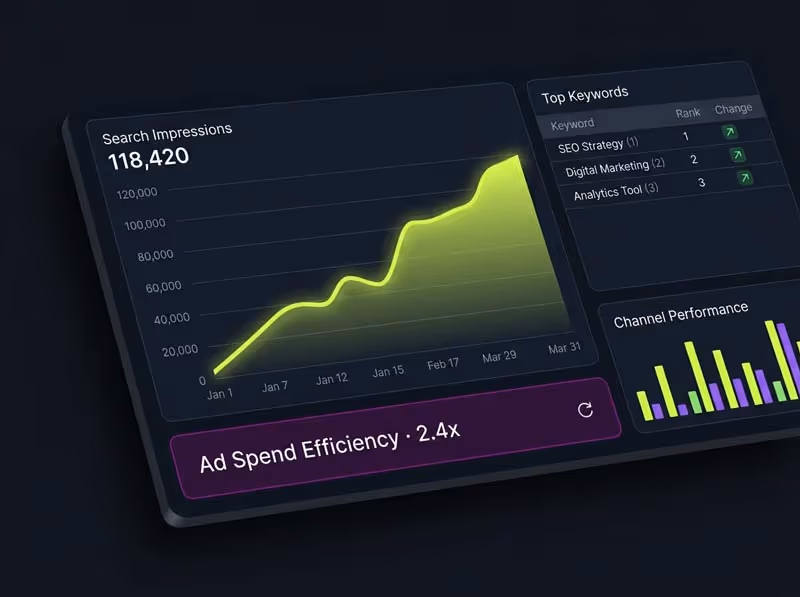
Measure what matters and ignore vanity
Set up analytics properly so that you can see which pages lead to calls, enquiries or purchases. Track form submissions, phone clicks and key interactions such as booking steps or downloads. Look for patterns rather than obsessing over day to day swings. If visitors drop off at the same section, rewrite it. If a service page draws traffic but few enquiries, examine whether the proof is weak or the next step is hidden. If a blog post brings qualified visitors, add a short invitation to talk at the end. Report in plain language so that anyone on the team can see progress and agree on the next change.
Keep improving with small, steady changes
The best sites are living things. Add a new case study each month, refine a paragraph that people always skip, replace a stock image with a real one, or tighten a form that feels heavy. When you make a change, note the date and watch how behaviour shifts over the next few weeks. Improvement is not a sprint. It is a habit. Local businesses in Suffolk that adopt this habit often find that growth feels calm and predictable rather than spiky and stressful.
A simple plan to act on today
Choose one service page and rewrite the first two hundred words so that a stranger would understand the value in a single read. Compress your largest image and retest your mobile speed. Add two honest reviews that mention the town and the outcome. Place a clear call to action at the midpoint of your home page. Update your contact page with opening hours and a friendly line about response times. These are small moves, but together they make a site feel cared for. That feeling is what sets you apart in a market where many sites look good at first glance but fall apart under real use.