Branding & Graphic Design in Bury St Edmunds: Building a Memorable Local Brand
Introduction: Think of the brands you love – maybe a favorite coffee shop, a trusted local tradesperson, or even a big company like John Lewis. What makes them stick in your mind? It’s not just their products or services; it’s their branding – the visual identity, the tone, the feeling you get when you see their logo or walk into their space. For businesses in Bury St Edmunds, crafting a strong brand image is just as crucial as it is for global companies. In a town with such rich history and character, a well-defined brand can help your business connect deeply with the community and stand out in the market. Whether you’re a new start-up looking to make a splash or an established firm aiming to refresh your image, investing in professional graphic design and branding is a step that can elevate your business to the next level.
At Futureproofs, we often say “your brand is your business’s personality.” It’s how you communicate who you are, what you value, and why customers should trust you – all at a glance. Good branding isn’t just a pretty logo (though logos are important); it’s an entire system of visuals and messaging working together consistently. When done right, it creates recognition, trust, and loyalty. Studies show that maintaining a consistent brand across all platforms can potentially increase revenue by up to 23% because customers are more likely to trust and engage with a brand they recognize and feel connected to.
In this post, we’ll explore how strong branding and graphic design can benefit Suffolk businesses. From logos and colour schemes to brochures and social media graphics, we’ll cover why design matters and how to approach it strategically. And because branding isn’t one-size-fits-all, we’ll talk about tailoring your brand to resonate with our local audience here in Bury St Edmunds (and the broader Suffolk area). Let’s dive into the art and science of building a memorable local brand!
Key Takeaways:
- First Impressions Count: It only takes a few seconds for someone to form an opinion of your business based on your visuals. A professional logo and cohesive look across your storefront, website, and marketing materials immediately signal credibility. In fact, 75% of consumers admit to judging a company’s credibility by its website design and branding – people infer quality of service from the quality of design.
- Stand Out in the Suffolk Market: Good branding differentiates you from competitors. If five businesses offer similar services in Bury St Edmunds, the one with a distinctive name, attractive signage, and clear message will be more likely to be remembered and chosen. Your brand should highlight what makes you unique.
- Emotional Connection: Branding helps you connect with customers on an emotional level. The colours, typography, and imagery you use can evoke specific feelings. For example, a soothing colour palette and elegant font can make a spa seem more relaxing and high-end, while a bold, vibrant design can make a café feel fun and energetic. These emotional cues can strongly influence buying decisions.
- Consistency Builds Trust: Using your brand elements consistently across all touchpoints – from business cards to social media to your shop interior – creates a sense of reliability and professionalism. Consistent branding can increase revenue by up to 23%, largely because it fosters trust. People like knowing what to expect from a brand.
- Local Relevance: Incorporating local flavor into your branding can resonate with the community. Whether it’s subtle (like using a colour inspired by the Abbey Gardens) or direct (like referencing Bury St Edmunds in your slogan), local touches show that you’re proud to be part of the community and can strengthen local loyalty.
Now, let’s explore these points in more depth and discuss practical steps for developing or refreshing your brand identity with top-notch graphic design.
Why Branding Matters for Small Businesses
You might be thinking, “Branding sounds important for big companies, but I’m just a small business in Suffolk. Do I really need to worry about it that much?” The answer is a resounding yes. In many ways, branding can be even more impactful for small and local businesses because your reputation in the community is everything.
Consider Hannah’s Medical Aesthetics – a local clinic we’ve mentioned. When Hannah first started, she was essentially building her brand from scratch in Newmarket’s competitive aesthetics scene. By developing a professional brand identity (logo, colour palette, styling) and using it across her clinic decor, website, and even staff uniforms, she presented her practice as trustworthy and established right from day one. Clients walking in see a consistent, polished image – which immediately gives them confidence in her services. That’s the power of branding: shaping perception. Without it, even if you offer great services, people might subconsciously doubt or undervalue you simply because your business “doesn’t look the part.”
Branding = Credibility: In a local context, word-of-mouth is gold. But often, a word-of-mouth recommendation will be followed by someone checking you out online or driving by your location. If what they see is underwhelming or inconsistent (maybe a blurry logo, mismatched signage, or outdated graphics), it creates friction. On the other hand, a well-crafted brand presence – say, a beautiful sign outside, a modern website that matches the look and feel, and brochures or Instagram posts with the same style – reinforces the message that you’re professional, attentive to detail, and likely offer quality. Essentially, good branding can make a small operation appear as competent as a larger one. It punches above weight.
Emotional and Cultural Appeal: People are emotional decision-makers. As customers, we often choose the café that feels cozy and inviting, or the shop that feels trendy and exciting – those feelings are conjured largely by design and branding. In Bury St Edmunds, where we cherish both tradition and a modern way of life, a brand that can tap into those local sensibilities will have an edge. For example, a bakery that brands itself with a vintage English bakery charm (think hand-drawn style logos, classic fonts, warm colours) might evoke nostalgia and trust, drawing in customers who value authenticity and heritage. Conversely, a tech startup in town might go for sleek, minimalist branding to signal innovation and attract a younger, modern clientele. Your brand helps attract the right customers by resonating with their values or aesthetic preferences.
Storytelling Through Design: Every brand has a story – maybe it’s your founder’s story, or your mission, or what inspired your products. Good graphic design can weave that story into visuals. Let’s say you run a sustainable home goods store. Your brand visuals could include earthy tones, a leaf motif, or recycled paper textures – all subtly telling the story of eco-friendliness. A customer might not consciously notice all those details, but they’ll get an overall sense that aligns with what you stand for. That alignment is what turns casual customers into loyal fans; they feel like they’re part of your story and values.
In short, branding isn’t an extra or a luxury. It’s a foundational aspect of how you present your business and how it will be perceived and remembered. And memory is key: with dozens of businesses vying for attention, you want to be the one that sticks in someone’s mind. A memorable name, a striking logo, or even a catchy tagline can ensure that when someone needs the service you offer, it’s your business that pops into their head first.
Elements of Effective Branding (Logos, Colours, and More)
Let’s break down the tangible components that make up your brand identity, and how thoughtful graphic design comes into play for each:
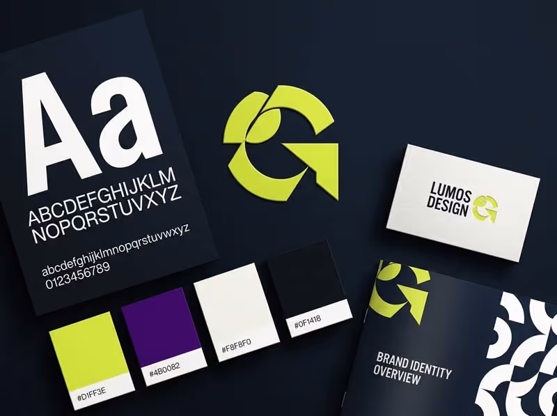
1. Logo Design: Your logo is often the centerpiece of your brand. It’s the one graphic that will appear everywhere: on your sign, website, business cards, possibly even your car or uniforms. A well-designed logo is:
- Distinctive: It should be unique enough that it doesn’t get confused with other logos or competitors. Simplicity can help – think of the bold “B” of the Bury St Edmunds town logo or the green mermaid of Starbucks. Simple shapes or memorable icons work well.
- Relevant: The style should hint at what you do or the vibe of your business. For instance, if you run a high-tech IT consultancy, a ultra-modern, clean typographic logo might suit you better than a playful illustrated one. If you have a kids’ boutique, something whimsical and colorful might be in order.
- Versatile: It should look good in different sizes and contexts. A strong logo works as a storefront sign, but also as a small social media profile picture. This usually means avoiding overly fine details that could get lost when scaled down. Also, having horizontal and vertical (stacked) versions is useful for fitting different spaces.
- Timeless: While you want to feel contemporary, it’s best to avoid ultra-trendy fonts or graphics that might look dated in a year. The idea is to design something that can last you many years with minor refreshes. Brand consistency over time is powerful – it takes repeated exposure for people to internalize a logo, so you don’t want to change it too often.
We often go through multiple concepts and revisions to get a logo just right. For example, when designing the logo for Zen Dog Club (one of our portfolio items), we explored various silhouettes of dogs and different typography to capture “luxury pet services” vibes. The final result was a sleek, sitting dog icon combined with elegant text – easy to recognize and print on everything from their van to their membership cards.
2. Colour Palette: Colours evoke emotions and carry associations. In branding, we usually pick a primary colour or two and a complementary set for accents/backgrounds.
- Color Psychology: For example, blue often conveys trust and calm (popular with banks, tech, healthcare), green hints at nature or growth (eco-friendly brands, wellness), red grabs attention and can imply excitement or urgency (food, retail sales), purple can feel creative or regal (beauty, luxury), and so on. Think about what emotions or qualities align with your business and how colour supports that. A local example: many heritage brands or Bury tourism materials use deep greens or maroons – colours that feel classic and stable.
- Contrast and Usability: Ensure your colours work in practical use. There should be enough contrast for text vs background for readability. Also consider printing: if your colours are too light or too many, some print jobs (like signage, embroidery) could be tricky or costly. We provide clients with Pantone/CMYK (print) and RGB/Hex (digital) values for their colours, so everything stays consistent.
- Limited but Flexible: Usually 2-3 main colours are sufficient (plus neutrals like black, white, gray). That keeps things cohesive. Overloading with many colours can look chaotic unless intentionally part of your style (like maybe a children’s play center might have a rainbow palette deliberately). A focused palette helps people subconsciously associate that colour scheme with you. For instance, if I say Coca-Cola, you picture red and white; if I say Barclays, you think of that teal blue. We want that effect for you too – maybe people start seeing a certain shade of blue and thinking of your consultancy, or a sunny yellow and thinking of your café.
3. Typography: The fonts you use are part of your brand’s voice. Are you formal, friendly, cutting-edge?
- Font Styles: Serif fonts (those with little feet, like Times New Roman) can feel traditional, trustworthy, even academic. Sans-serif fonts (clean, no feet, like Arial or Helvetica) feel modern, clear, and straightforward. Script or decorative fonts can add elegance or personality, but should be used sparingly (often for a logo or headlines, not body text). We choose fonts that align with the brand personality. A law firm might go with a strong, classic serif for the logo and a clean sans-serif for body text – conveying authority and clarity. A fashion boutique might choose a chic modern font with unique flair.
- Consistency: We’ll typically select a couple of brand fonts – one for headings/logos and one for body content – and stick to them. This ensures all your materials look uniform. If you’re designing flyers, website, and packaging all with different fonts, it fragments your identity. But using the same typefaces everywhere ties it all together. For example, one of our clients uses the same stylish font on their shop sign, website headers, and even on their invoices – it’s all part of the brand presentation.
- Readability: Especially for body text and important info (like phone numbers, addresses), the font must be easy to read. Fancy fonts are fun but if people struggle to read your contact details, that’s a fail. We test fonts for legibility at various sizes. This is a detail sometimes overlooked by DIY branding attempts – a gorgeous curly font might look nice in a logo but is terrible for small print or web content. We avoid such pitfalls by pairing fonts appropriately.
4. Graphic Elements and Imagery: Beyond logo and colours, brands often have additional style elements:
- Patterns or Icons: Some brands use a pattern (like a repeating shape or a watermark graphic) as a backdrop on business cards or packaging. Or a set of custom icons that match their logo style (like an icon for each service they offer). These little touches can enrich materials and give more tools in the design toolkit to create a unique look. For instance, a coffee shop might have a little illustrated coffee bean or latte art pattern they use on their loyalty cards or cups.
- Photography Style: If applicable, the style of photos you use (bright and airy vs dark and moody, candid vs posed, etc.) also affects brand perception. A local example: a wedding photographer might brand themselves with romantic, soft-toned imagery on their site, establishing an emotional tone, whereas a CrossFit gym might use high-contrast, action shots to convey energy. While photos themselves aren’t “graphic design” that we create, we often advise on choosing or editing photos to fit the brand aesthetic (and sometimes apply consistent filters or colour grading to them).
- Voice and Tone: Although this dips into copywriting, it goes hand-in-hand with visual branding. Are your marketing messages written in a formal tone (“Dear Customers, we cordially invite you…”) or a casual one (“Hey folks! Come check this out!”)? The tone should match the visual vibe. We often develop brand guidelines that include notes on tone of voice, so whoever writes your social media or ads keeps it consistent. Consistency in messaging further solidifies brand identity. Imagine if Nike suddenly used flowery, verbose language in an ad – it would feel off, since we expect their tone to be bold and succinct (“Just Do It”).
When all these elements – logo, colour, typography, imagery, and tone – come together cohesively, you get what we call brand identity. And when customers encounter that identity repeatedly – on your shopfront, on a Facebook post, in an advert in the Bury Free Press – it starts to imprint. Over time, that consistent presentation builds familiarity. And familiarity, in business, often translates to trust. People tend to prefer the familiar. By presenting a consistent brand, you essentially become a familiar face in the marketplace more quickly.
As graphic designers and branding specialists, our job is to create those elements with skill and intention, then help you deploy them consistently. We often create a Brand Style Guide for clients, which is a document outlining all of the above – showing the logo in its various uses, listing the exact colours and fonts, and providing dos and don’ts (like how to space the logo, or not to stretch it, etc.). This guide becomes the rulebook to ensure any future material (whether designed by us, you, or another vendor) stays true to the brand. Think of it as protecting the integrity of what we’ve built.
Case Study: Local Branding Success Stories
Sometimes the best way to illustrate the impact of good branding is to look at concrete examples. Let’s talk about a couple of local or regional brands that have seen success and how their branding played a role:
Hannah’s Medical Aesthetics (Newmarket): We’ve touched on Hannah’s clinic, but let’s detail what branding elements we crafted for her and the results:
- We designed a logo that included her name in an elegant serif font with a subtle icon of a butterfly (symbolizing transformation and care – reflecting her aesthetic services). The butterfly motif became a gentle pattern used in her clinic’s print materials and website background – giving a consistent thematic touch.
- Chose a colour scheme of soft teal and white, conveying cleanliness, calm, and a hint of luxury. This differentiates her from, say, a medical clinic that might use stark blues, or a beauty spa that might use pinks. The teal became a signature colour – from the signage to the treatment room accents.
- We also guided the interior decor branding: reception area has a feature wall with the logo in metallic finish, staff wear uniforms that match the brand colours. When clients walk in, they immediately sense a professional, unified identity.
- With this branding in place, Hannah’s clinic quickly built credibility. Coupled with her excellent service, the branding made the business look established and trustworthy, even though it was a relatively new venture. Many clients who found her online mentioned they felt reassured by how professional everything looked, which helped them choose her over others. Her consistent branding across online and offline channels contributed to that trust. As noted earlier, her glowing testimonial about our work also highlights that she valued the brand’s influence on boosting her presence and attracting clients.
Blend Coffee & Wine Bar (Bury St Edmunds): This is a real local gem that opened recently. While we weren’t the branding agency for Blend, as locals we can see what they did well:
- They chose a great name: “Blend” works both for coffee blending and blending coffee + wine concepts. It’s short, memorable, and descriptive.
- Their logo and sign: If you pass by Abbeygate Street, you’ll notice Blend’s sign is modern, with a clean black-and-white palette and a stylized wordmark. It immediately communicates “contemporary and cool.” It doesn’t have cheesy coffee cups or wine glasses on it, which might have made it feel generic; instead, it’s just the name in a sleek font, which actually stands out more and feels confident.
- Interior graphic touches: they carry the black-and-white modern vibe inside, from menu boards to their loyalty cards. The consistency is striking – you feel like everything, down to the latte art in their Instagram posts, aligns with a simple, hip aesthetic. This consistency helped them quickly cultivate a brand following. People take photos in the café because it’s got such a coherent style, and when those photos circulate on social media, the brand spreads.
- They’ve also cleverly used local engagement: their branding often ties into local events (like special edition drinks for the Christmas Fayre with branded signage). This shows how a brand can flex for local relevancy without losing core identity.
In a short time, Blend has become a talk of the town partly because their branding makes the place an experience, not just another café. It appeals especially to young professionals and social media enthusiasts who appreciate a well-branded environment (it feels on par with something you’d find in Shoreditch or Cambridge, which in Bury is refreshing). The takeaway: good branding can position a small business as trendsetting and aspirational, which helps drive word-of-mouth.
Cambridge Fireplaces (Cambridge): A bit out of Bury, but relevant regionally. This family-run business rebranded a couple of years ago with our help:
- We created a sturdy, warm logo featuring a stylized flame icon with the Cambridge skyline subtly integrated. This instantly tied their specialty (fireplaces) with local identity (Cambridge), making it memorable.
- Chose colours like deep orange and charcoal grey – orange for warmth/fire, grey for stone/soot, fitting for fireplaces.
- Designed vehicle wraps, showroom signage, and a new website all using the cohesive new brand style. Their vans driving around with the bright orange flame and logo are now very noticeable on the streets – mobile branding at work.
- The result? They saw increased inquiries that referenced “we saw your van” or “your website looked great”. The professional look differentiated them from more old-school competitors whose branding might be stuck in the 90s. It gave them a modern edge while still appearing approachable (since the logo had that family/local touch with the skyline). The branding update actually reinvigorated the business and contributed to growth (they expanded their service area since demand rose).
These examples underscore how investment in branding isn’t just about looking pretty – it has direct business benefits:
- Attracting more customers (especially those who value professionalism and style).
- Justifying pricing (people are generally willing to pay a bit more to a business that appears high quality and trustworthy).
- Encouraging referrals (customers proud of being associated with a cool brand will talk about it).
- Smoothing marketing efforts (when your visuals are on point, any flyer, ad, or campaign you do will have more impact).
Of course, branding alone doesn’t guarantee success (you need good service and marketing too), but it’s a critical pillar. We often like to say: Good branding makes your marketing more effective. Because whether it’s your website (hello lower bounce rates, as people stick around because it looks credible) or your social posts (higher engagement if it looks polished) or your flyers (people actually read it if the design catches their eye), branding uplifts all those activities.
Maintaining Brand Consistency Across All Platforms
So you’ve got a spiffy new brand – great! The next challenge is to implement it everywhere and keep it consistent. Inconsistent branding is like having a conversation with someone who keeps changing their story – it creates confusion and distrust. We want your customers to get the same brand experience no matter how they interact with you.
Here’s how to ensure brand consistency (and why it matters):
Brand Guidelines: As mentioned, we provide a brand style guide document for you. This becomes your bible for branding. It covers:
- The exact colors (with codes) to use.
- The fonts and when to use them.
- Logo usage rules (like minimum size, clear space around it, where to use the icon vs full logo, etc.).
- Examples of correct vs incorrect uses (like “don’t stretch the logo vertically” or “don’t change the logo color arbitrarily”).
- Tone of voice and key messaging points if applicable.
By sharing this guide with anyone who creates material for you (employees, printers, other agencies, etc.), you create accountability that the brand stays cohesive. For instance, if you hire a sign maker to do a window decal, you’d give them the logo file and brand colors so it matches your business cards and website. Or if you sponsor a local event and they want to use your logo on promo materials, you can supply the exact file and specify “use it on white background only, please” if that’s a rule – preventing any wonky alterations.
Digital Platforms:
- Website: Obviously, we integrate your branding fully on your website during design (colours, fonts, images, content tone). Maintaining it means if down the road you add a page or run a promotion, stick to the style. Don’t suddenly use off-brand colours for one promo because you “felt like purple today” – unless there’s a strategic reason. We often set up your website in a way that it’s easy to follow the style (like predefined heading styles, etc.). If a CMS like Webflow is used (as we do), we ensure the branding is part of the template and cross-site.
- Social Media: It’s easy to go rogue on social since content flows daily. However, try to keep a branded look. That might mean using your logo as the profile pic, using a consistent filter or editing style on photos, and incorporating your brand colours into graphics. If you post quote images or announcements, use your brand font and colors via templates (tools like Canva can store your brand colours and fonts if you’re DIYing). It looks much more professional if someone glances at your Instagram grid and sees a harmonious palette and style rather than a jumble. Also, maintain your tone in captions; if your brand voice is friendly and witty, keep it that way across tweets, Facebook posts, etc.
- Email and Comms: For email newsletters or even the signature in your everyday emails – use your logo, use brand-aligned colors, and maintain tone. An email newsletter from our earlier example (the fitness gym) should look energetic, with maybe their bold color header and motivational language, whereas the bakery might have a calmer layout with a pastel header and cozy wording. Platforms like MailChimp allow you to set a brand template so every email you send follows the same format. Also consider consistency in things like email subject lines or how you address customers (“Dear John” vs “Hi John,” – pick a style).
- Online Directories and Ads: If you run Google Ads or have a listing on a site like AllAboutBury or TripAdvisor, ensure your uploaded images and description align with your brand. If your official brand name is “Blend Coffee & Wine Bar” don’t list it as “Blend Cafe” somewhere – consistency in naming is key for recognition. Use your logo as the image where appropriate (or a professional brand photo).
Physical Materials:
- Signage and Decor: Already discussed but to reiterate: your location should embody your brand. Same fonts on signage as your logo, same color paint or accents as your palette, etc. This extends to little things: the menu board design, the way prices are tagged, the music playlist even (if you brand yourself as a chill lounge, pumping hard rock wouldn’t fit – branding can include sensory elements too like sound and scent!). Some shops even choose a signature scent or have staff greet customers with a signature phrase – these are all brand consistency moves that create a cohesive experience.
- Print Collateral: Business cards, letterheads, flyers, brochures, banners, uniforms – everything printed should follow the style guide. We usually design a suite of templates: e.g., a letterhead in Word format that has the logo placed correctly, or a PowerPoint template for presentations with brand colors, etc. So when you or your team makes new documents, they stay branded. A bank we consulted for had a notorious issue of every branch making their own posters in Word with random clipart (yikes!) – the solution was giving them a set of corporate templates and training on using them, which drastically improved brand consistency and frankly looked more professional to customers (no more Comic Sans on window posters!). The lesson: empower your team with the right tools and guidelines to stick to the brand.
- Packaging and Products: If you have product packaging, invest in branding that too – whether it’s a simple sticker on a bag or a fully custom printed box. Same with things like shopping bags, gift cards, etc. Every time someone takes something of yours home, it’s a brand impression opportunity. It reinforces memory and signals quality. A plain bag vs a bag with your logo and colours – which is more memorable? The latter, of course. And if someone sees their friend carrying that bag, voila – extra brand exposure. One more benefit: nicely branded packaging can even serve as free social media content when customers snap pics of their “unboxing” experience.
Now, why is consistency so important? Two main reasons:
- Recognition: The more consistent you are, the fewer interactions it takes for someone to remember you. As mentioned earlier, a Lucidpress study found that consistent brand presentation can increase revenue significantly. That’s because people are more likely to buy from brands they recognize and trust. If every time someone sees you, you look a bit different, it might not click that it’s the same business they saw elsewhere. Consistency basically amplifies your marketing because all touchpoints are working together to imprint the brand in people’s minds.
- Professionalism: Consistency implies organization and reliability. If you can keep your branding consistent, it subconsciously suggests you pay attention to detail and care about quality. Think of a well-known chain (like Marks & Spencer) – no matter which store you go to, signage, uniforms, receipts, etc., all look unified. That consistency across dozens of locations builds trust that the company is solid. For a local business, you might have fewer “locations” but replace that concept with “platforms” – in-store, online, in print – and the principle holds. People trust a business that “has it together” across the board.
Finally, maintaining consistency is an ongoing process. Brands can evolve (we do occasionally update style guides or refresh logos after many years to stay current), but those changes are usually deliberate and then become the new standard. What you want to avoid is unintentional drift – where one day you realize your Facebook page looks entirely different from your website which is entirely different from your shop decor. Doing a quick brand audit every now and then (we can help with that) is a good practice: lay out your business card, brochure, screenshot of website, social profile, etc. side by side and see if it all looks like one family. If something sticks out as off, it’s worth bringing it in line.
Conclusion: Crafting a compelling brand and executing consistent graphic design is one of the best investments you can make in your business’s long-term success. It creates that memorable identity which magnetically draws the right customers and keeps them coming back. Whether you’re starting from scratch or thinking it’s time for a rebrand, focus on those core elements – logo, colors, typography, and voice – and ensure they tell your story and appeal to your target audience. And once you have that brand identity, guard it and use it everywhere, big and small.
At Futureproofs, we take pride in helping Suffolk businesses uncover and express what makes them special through branding. From conceptualization to final designs, and through all the business materials down the road, we’re passionate about building brands that not only look amazing but also work – driving recognition, loyalty, and growth. Remember, your brand is your promise to the customer – promise them quality, promise them uniqueness, promise them reliability, by showing it in every color, every font, every interaction.
Ready to make your brand unforgettable in Bury St Edmunds and beyond? Let’s get creative – together, we’ll design a brand identity that truly brands itself into people’s hearts and minds.